



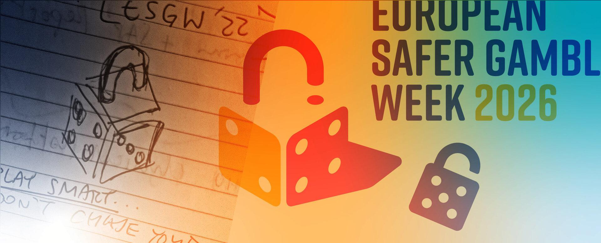
Here at ACW our working life is, to a great extent, governed by branding. Whether it’s creating or developing new brands ourselves or working within the bounds of existing guidelines, branding in some way informs our every working day
The discipline of branding long ago evolved from what was once termed ‘corporate identity,’ but in some ways that now out-dated term serves better to describe the field than its new descriptor. A modern Brand encompasses the whole ‘identity’ of an organisation – way beyond the limits of the way it presents itself visually.
However, this expanding of the corporate identity definition does not diminish the importance of the logo as the cornerstone of the whole brand edifice. Logos remain much loved, hated, trusted, mistrusted and endlessly debated social artefacts. There are good reasons why Big Brands spend Big on their logos, guard them so jealously and receive so many column inches when they change them: logos still matter.
Logo design is one of those tricky tasks that can nowadays all too easily be handed over to AI – with results almost guaranteed to be disastrous. Successful logo design is a discipline, like so many in the creative space, that really demands the human touch. When it comes to logos, distinctiveness and originality derive from the unpredictable quirks and foibles of the human mind as it mulls over a problem, and of the human hand as it clutches a pencil and doodles away on a piece of paper – their creation is always a challenge, and there are no short-cuts.
European Safer Gambling Week is an annual pan-European initiative organised by EGBA (European Gaming & Betting Association) to raise awareness about safer gambling and reinforce a culture of player protection in the industry. It brings together stakeholders from across Europe’s gambling sector to promote safe and sustainable play, by sharing tips, tools, resources and best practice.
The initiative needed a strong and recognisable visual treatment that could persist from year to year, with just minor tweaks to keep it fresh. Of course, it needed a logo.
Reaching for our pencils, we started to think broadly about the topic of gambling, and experimented with a series of ideas based on well-recognised gambling imagery. Good designers don’t dismiss clichés and the familiar; they recognise them as successful communication, and try to turn them into something fresh and unique. We liked the die for its familiarity, strong graphic quality and the opportunity it gave for the spots to expand the meaning beyond that of a bland icon – seven spots denoting the length of the event.
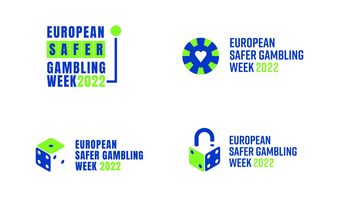
The introduction of the curved line to create a padlock – adding the key concept of security to that of gambling – was the happy accident that emerged from the process of sketching and playing with ideas on paper, and gave us the unique and appropriate symbol the event needed.
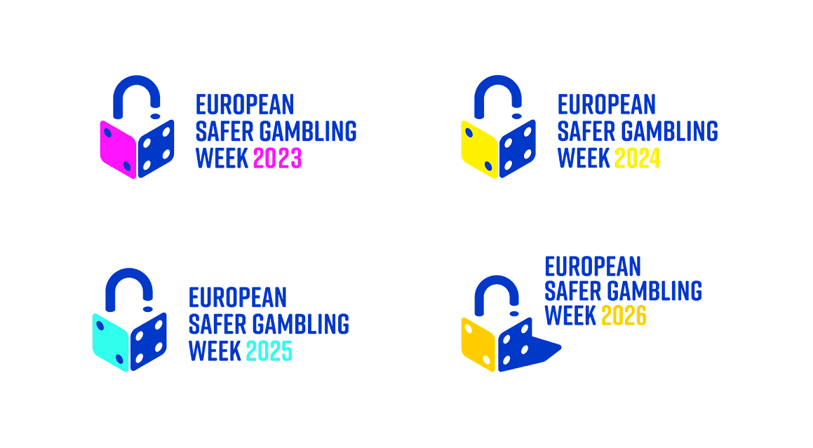
The resulting logo lent itself easily to a simple annual colour change to give it a fresh look and keep the communications distinct from year to year, with the 2026 version getting a little more of an update, introducing the shadow, redrawing the die and re-addressing the relationship between the type and the symbol – formal changes which leave the strong central idea unaltered and the logo fit to serve for many years to come.
